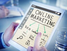
You’ve laid the groundwork with solid search engine optimization (SEO) and successfully jumped your website up in ranking. You appear higher on the search engine results page (SERP) and your carefully written title tags now receive more impressions than ever. Click-through rate (CTR) is strong, driving a spike in traffic to your site, but there’s only one problem: no one is converting once they get there. Another better way to get rankings is to consider toward optimize website for mobile devices.
What’s the issue? All these key performance indicators (KPIs) are on the rise, so why aren’t these improvements reflected in revenue? There are many reasons that could explain why revenue is low when performance is high, but today’s post discusses one of the biggest culprits: the landing page.
Even though a landing page might look the same as a web page, it functions differently and should, therefore, be designed differently. Here are several tips to keep in mind while designing the layout of your landing page to make it as effective as possible. For this, you can use web design tricks for better display results.
1. Set a Business Goal
Landing pages are a little different than the web pages that structure the main site, encourage exploration, and serve several different goals—whether that may be to highlight your company culture on a Careers page, or to establish yourself as an industry leader with informative blog content.
On the contrary, a landing page has a very specific goal catered to a certain campaign. Users “land” at this destination after clicking on a special link in an email or an ad that directs them to the site. There, they receive a call to action such as a purchase, form submission, or registration—which is how you can increase conversion rate, drive revenue, and strengthen your bottom line.
2. Know Your Elements
Every landing page is composed of grouped elements, and the ones that convert best have a solid grasp on these fundamental building blocks. They can all be structured differently, but every page should include these basics:
- Hero image, or a large graphic located front and center on the banner at the top of the page, providing the first visual element a visitor will see
- Header or headline statement that matches the intent of the link clicked by the visitor to land on the page
- Subheader text that supports the headline with additional information
- Key features or benefits that succinctly describe the product or service
- Social proof (testimonials, reviews, customer logos, etc.) that inspire confidence and help convince visitors
- Call to action (CTA) with an eye-catching button that visitors are encouraged to click
- Form fields for essential contact information visitors can supply to learn more
Of course, some of these elements may not be necessary depending on your offering, but strategically placing these basic building blocks on your landing page is essential to conversion.
Let’s take a look at an example of a great layout design below:
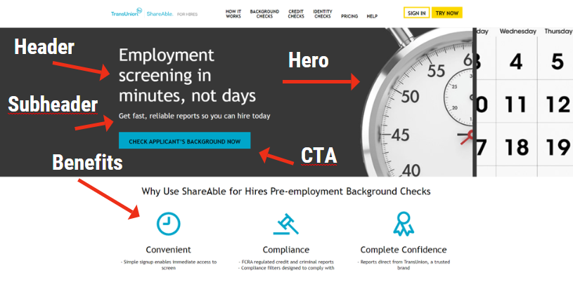
We see several critical elements above the fold: a creative hero, a direct headline with additional details, clearly defined benefits summarized as easy-to-read icons, and a bright call to action that stands out against the black background. But there’s another reason for why this landing page is cleverly optimized that we’ll analyze in the next section.
3. Create a Unique Selling Proposition
If you want visitors to convert, you need to convince them with a unique selling proposition (USP). The USP explains why your offering is better than your competitors by highlight what sets it apart. You need to position your product or service as different than those other guys by answering the big question, “What makes this offer so special?”
The best way to answer that is to strike a chord in the hearts of your target audience by identifying their common pain points. If you look at our example landing page, we can tell that employers must be burdened by the extensive amount of time that’s typically required to screen applicants for employment.
ShareAble for Hires taps into this concern by offering a faster, simplified solution. The headline tells employers that they can screen “in minutes, not days”. This is reinforced by the hero that juxtaposes an hourly clock against a monthly calendar. A sense of urgency is strengthened by the CTA that says, “CHECK APPLICANT’S BACKGROUND NOW”, offering an immediate solution to their problem.
Their strategy is effective, but there’s one way this landing page could be better designed for conversion rate optimization (CRO), which brings us to our next tip…
4. The Fewer the Links, the Better
The biggest difference between a landing page and a web page is that the former should have far fewer links than the latter. Although strategically placed links can provide smart SEO value, and they allow users to navigate the site, they’re also clickable distractions that might carry them away from the call to action.
So, looking back at our example above, we could improve CRO by removing the menu across the top panel. It contains several options that direct users to various service pages for criminal background checks and credit checks, as well as pages about how the service works and how pricing is structured.
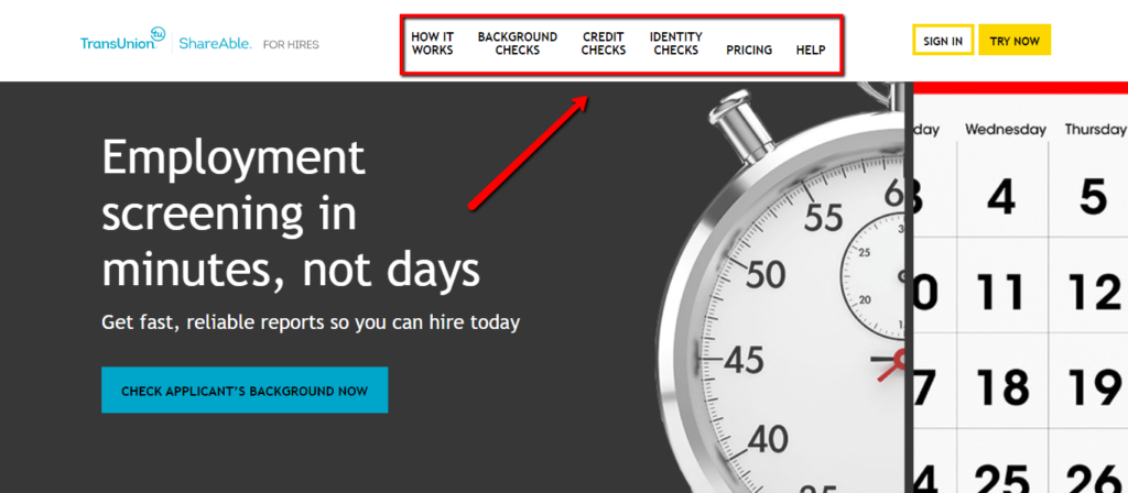
While this is information may be useful, it shouldn’t belong above the fold of a landing page. (Note: when we talk about the “fold”, we’re referring to the cut-off point beneath which content can’t be seen in the window unless a user scrolls further down the page.) Why? Because conversion rate increases as on-page link presence decreases.
If a user lands and sees one, focused advertisement promoting a single offer, they’re much more likely to convert than if they shopped around, compared products, read a recent press release, and so on.
In our case study, few employers actually need credit checks for job applicants and background reports are already included within their screening solution, so there’s no need to distract potential customers with unnecessary clickbait. If they’d like more details, it’d be better to include a form where they can enter their email in exchange for more information. Then, you can nurture that warm lead through email correspondence and convince them to convert as they move down the sales funnel.
Takeaways
An effective landing page can improve conversion rate, increase revenue, and drive business growth. Keep these tips in mind as you strategize your next campaign and design the page layout, so you can see more sales and greater success.